Progress
A Shadcn progress bar.
Example:
shad.Progress(value=0.6, width=300)

Inherits: LayoutControl
Properties
bar_height- The height of the bar.bgcolor- The color of the track behind the filled part.color- The color of the filled part.value- The progress, from0.0(none) to1.0(complete).
Example
Shadcn Progress
play_arrowTry Online
import flet_shadcn_ui as shad

import flet as ft


def main(page: ft.Page):
    page.title = "Shadcn Progress"

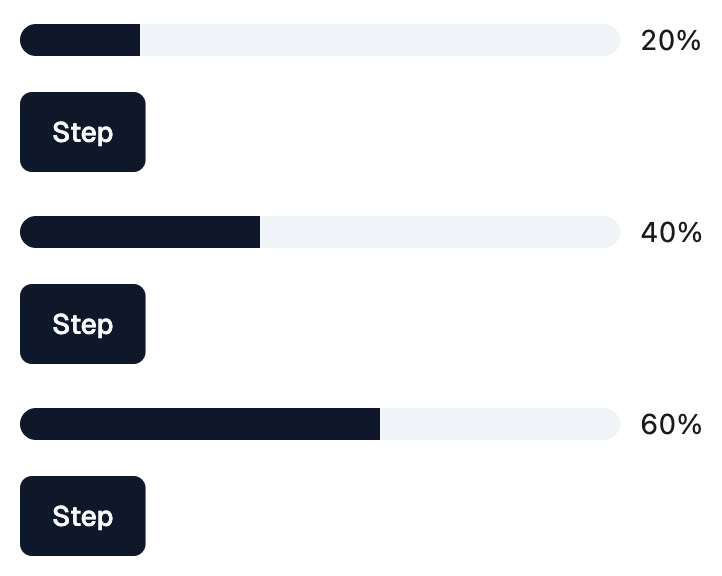
    def handle_step(e: ft.Event[shad.Button]):
        progress.value = min(1.0, round(progress.value + 0.2, 1))
        label.value = f"{int(progress.value * 100)}%"

    progress = shad.Progress(value=0.2, width=300)
    label = ft.Text("20%")

    page.add(
        ft.SafeArea(
            content=ft.Column(
                spacing=16,
                controls=[
                    ft.Row([progress, label]),
                    shad.Button("Step", on_click=handle_step),
                ],
            )
        )
    )


if __name__ == "__main__":
    ft.run(main)
Properties
bar_heightclass-attributeinstance-attribute
bar_height: Number | None = NoneThe height of the bar.
If None, defaults to 16.
bgcolorclass-attributeinstance-attribute
bgcolor: ColorValue | None = NoneThe color of the track behind the filled part.
If None, a translucent primary color is used.
colorclass-attributeinstance-attribute
color: ColorValue | None = NoneThe color of the filled part.
If None, the primary color of the theme is used.