InputOTP
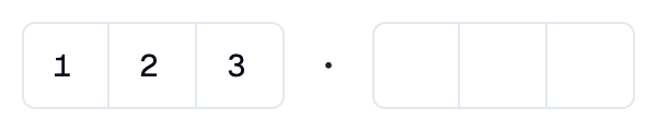
A Shadcn one-time password input: a row of single-character boxes.
Example:
shad.InputOTP(length=6, groups=[3, 3])
Inherits: LayoutControl
Properties
description- Helper text shown below this input.error_text- An error message shown in red below this input.groups- How the boxes are split into groups, as a list of group sizes that add up tolength.keyboard_type- The type of on-screen keyboard to show.label- The label shown above this input.length- The number of characters.separator- The icon or control shown betweengroups.value- The characters entered so far.
Events
on_change- Called when the characters change.on_complete- Called when every box is filled.
Example
Shadcn InputOTP
import flet_shadcn_ui as shad

import flet as ft


def main(page: ft.Page):
    page.title = "Shadcn InputOTP"

    def handle_change(e: ft.Event[shad.InputOTP]):
        status.value = f"Entered: {e.control.value}"

    def handle_complete(e: ft.Event[shad.InputOTP]):
        status.value = f"Verifying {e.control.value}..."

    def handle_clear(e: ft.Event[shad.Button]):
        otp.value = ""
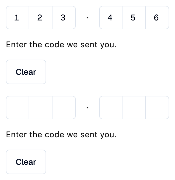
        status.value = "Enter the code we sent you."

    otp = shad.InputOTP(
        length=6,
        groups=[3, 3],
        on_change=handle_change,
        on_complete=handle_complete,
    )
    status = ft.Text("Enter the code we sent you.")

    page.add(
        ft.SafeArea(
            content=ft.Column(
                spacing=16,
                controls=[
                    otp,
                    status,
                    shad.Button(
                        "Clear",
                        variant=shad.ButtonVariant.OUTLINE,
                        on_click=handle_clear,
                    ),
                ],
            )
        )
    )


if __name__ == "__main__":
    ft.run(main)
Properties
descriptionclass-attributeinstance-attribute
description: StrOrControl | None = NoneHelper text shown below this input.
error_textclass-attributeinstance-attribute
error_text: str | None = NoneAn error message shown in red below this input. The slot borders turn red too.
Set it after validating the value, and set it back to None (or an empty
string) to clear the error.
groupsclass-attributeinstance-attribute
groups: list[int] | None = NoneHow the boxes are split into groups, as a list of group sizes that add up
to length. For example, [3, 3] shows two groups of three.
If None, all boxes form one group.
Raises:
- ValueError - If its sizes do not add up to
length.
keyboard_typeclass-attributeinstance-attribute
keyboard_type: KeyboardType = KeyboardType.NUMBERThe type of on-screen keyboard to show.
labelclass-attributeinstance-attribute
label: StrOrControl | None = NoneThe label shown above this input.
It turns red while error_text is set.
lengthclass-attributeinstance-attribute
length: int = 6The number of characters.
Raises:
- ValueError - If it is not strictly greater than
0.
separatorclass-attributeinstance-attribute
separator: IconDataOrControl | None = NoneThe icon or control shown between groups.
If None, a dot is shown.
Events
on_changeclass-attributeinstance-attribute
on_change: ControlEventHandler[InputOTP] | None = NoneCalled when the characters change.
The data property of the event handler argument
contains the new value.
on_completeclass-attributeinstance-attribute
on_complete: ControlEventHandler[InputOTP] | None = NoneCalled when every box is filled.
The data property of the event handler argument
contains the full value.