Input
A Shadcn text input.
Example:
shad.Input(placeholder="Email", keyboard_type=ft.KeyboardType.EMAIL)
shad.Input(placeholder="Password", password=True)

Inherits: LayoutControl
Properties
autofocus- Whether this input should be focused on initial display.description- Helper text shown below this input.error_text- An error message shown in red below this input.keyboard_type- The type of on-screen keyboard to show.label- The label shown above this input.leading- An icon or control shown before the text.max_length- The maximum number of characters that can be entered.max_lines- The maximum number of lines to show.min_lines- The minimum number of lines to occupy.obscuring_character- The character used to hide the entered text whenpasswordisTrue.password- Whether to hide the entered text, for example for passwords.placeholder- The hint shown whilevalueis empty.read_only- Whether the text can be selected but not changed.text_align- How the text is aligned horizontally.trailing- An icon or control shown after the text.value- The current text of this input.
Events
Methods
focus- Requests focus for this input.
Example
Shadcn Input
import flet_shadcn_ui as shad

import flet as ft


def main(page: ft.Page):
    page.title = "Shadcn Input"

    def handle_change(e: ft.Event[shad.Input]):
        echo.value = f"Email: {e.control.value}"

    def handle_submit(e: ft.Event[shad.Input]):
        echo.value = f"Submitted: {e.control.value}"

    echo = ft.Text("Email: ")

    page.add(
        ft.SafeArea(
            content=ft.Column(
                width=320,
                controls=[
                    shad.Input(
                        key="email",
                        placeholder="Email",
                        keyboard_type=ft.KeyboardType.EMAIL,
                        leading=shad.LucideIcons.MAIL,
                        on_change=handle_change,
                        on_submit=handle_submit,
                    ),
                    shad.Input(
                        placeholder="Password",
                        password=True,
                        leading=shad.LucideIcons.LOCK,
                    ),
                    shad.Input(placeholder="Disabled", disabled=True),
                    echo,
                ],
            )
        )
    )


if __name__ == "__main__":
    ft.run(main)
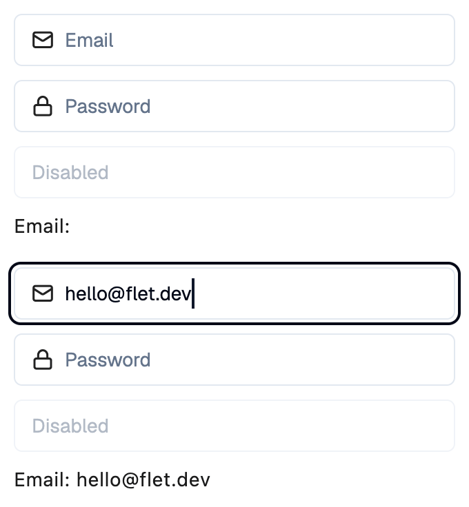
Properties
autofocusclass-attributeinstance-attribute
autofocus: bool = FalseWhether this input should be focused on initial display.
descriptionclass-attributeinstance-attribute
description: StrOrControl | None = NoneHelper text shown below this input.
error_textclass-attributeinstance-attribute
error_text: str | None = NoneAn error message shown in red below this input. The border turns red too.
Set it after validating the value, and set it back to None (or an empty
string) to clear the error.
keyboard_typeclass-attributeinstance-attribute
keyboard_type: KeyboardType = KeyboardType.TEXTThe type of on-screen keyboard to show.
labelclass-attributeinstance-attribute
label: StrOrControl | None = NoneThe label shown above this input.
It turns red while error_text is set.
leadingclass-attributeinstance-attribute
leading: IconDataOrControl | None = NoneAn icon or control shown before the text.
max_lengthclass-attributeinstance-attribute
max_length: int | None = NoneThe maximum number of characters that can be entered.
max_linesclass-attributeinstance-attribute
max_lines: int | None = 1The maximum number of lines to show.
If None, the input grows with its text.
min_linesclass-attributeinstance-attribute
min_lines: int | None = NoneThe minimum number of lines to occupy.
obscuring_characterclass-attributeinstance-attribute
obscuring_character: str = '•'The character used to hide the entered text when password is True.
passwordclass-attributeinstance-attribute
password: bool = FalseWhether to hide the entered text, for example for passwords.
placeholderclass-attributeinstance-attribute
placeholder: StrOrControl | None = NoneThe hint shown while value is empty.
read_onlyclass-attributeinstance-attribute
read_only: bool = FalseWhether the text can be selected but not changed.
text_alignclass-attributeinstance-attribute
text_align: TextAlign = TextAlign.STARTHow the text is aligned horizontally.
trailingclass-attributeinstance-attribute
trailing: IconDataOrControl | None = NoneAn icon or control shown after the text.
Events
on_blurclass-attributeinstance-attribute
on_blur: ControlEventHandler[Input] | None = NoneCalled when this input loses focus.
on_changeclass-attributeinstance-attribute
on_change: ControlEventHandler[Input] | None = NoneCalled when the text changes.
The data property of the event handler argument
contains the new text.
on_clickclass-attributeinstance-attribute
on_click: ControlEventHandler[Input] | None = NoneCalled when this input is clicked.
on_focusclass-attributeinstance-attribute
on_focus: ControlEventHandler[Input] | None = NoneCalled when this input receives focus.
on_submitclass-attributeinstance-attribute
on_submit: ControlEventHandler[Input] | None = NoneCalled when the user submits the text, for example by pressing Enter.