DateRangePicker
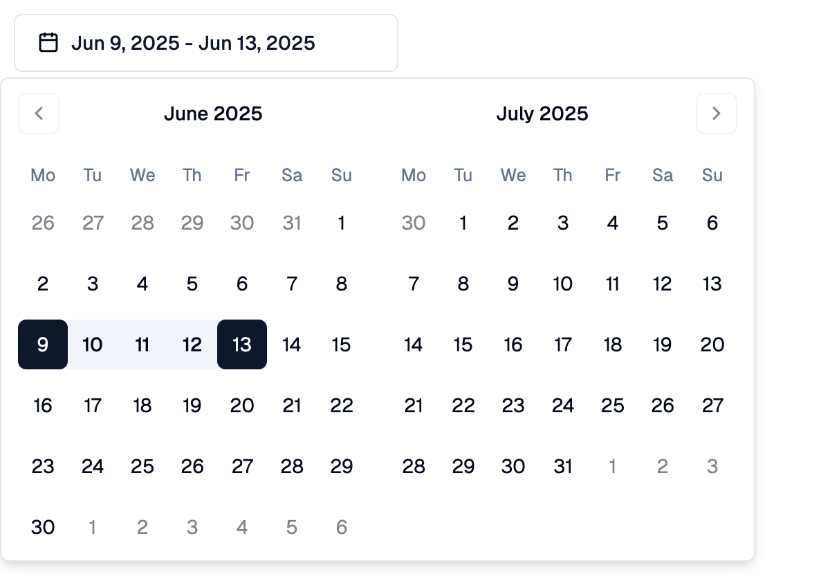
A Shadcn date range picker: a button that opens a two-month calendar in a popover for picking a start and an end day.
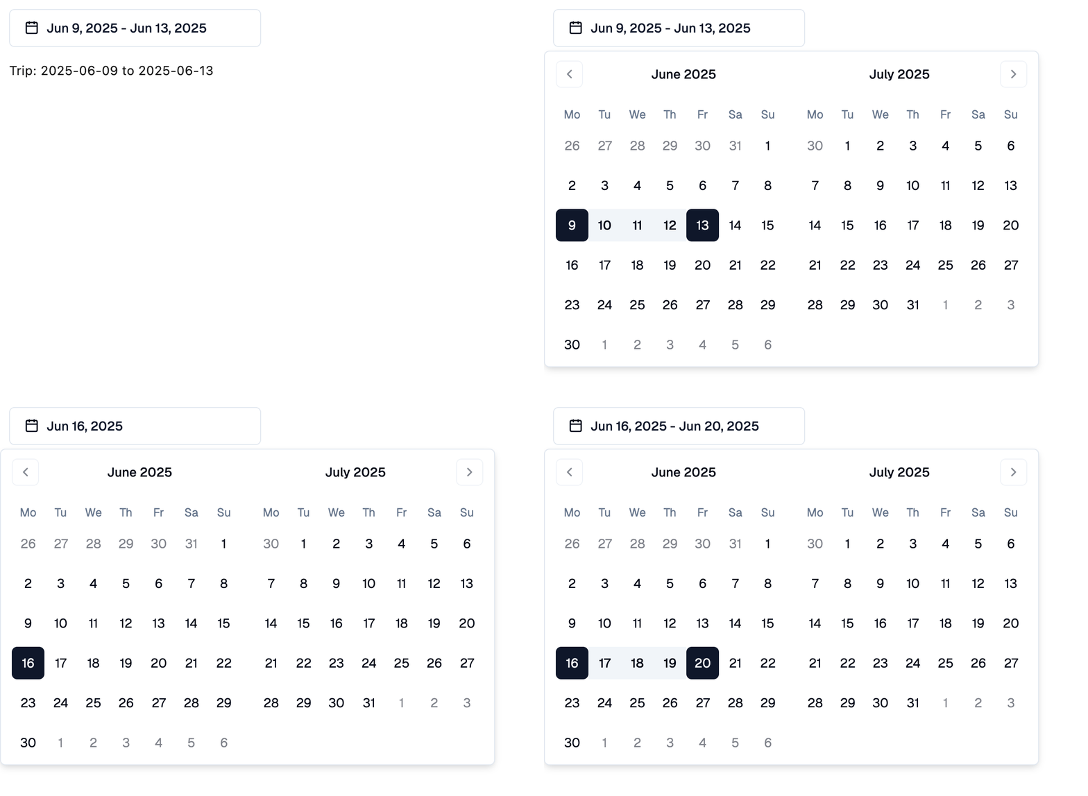
The first click picks the start day and the second click the end day. Clicking again after a range is complete starts a new range on the clicked day. Before the end is picked, clicking a day earlier than the start moves the start.
Picked days are set to a datetime at midnight UTC of that day, so
.date() gives the picked date in any time zone. A date can be assigned
as well.
Example:
shad.DateRangePicker(
    on_change=lambda e: print(e.control.start_value, e.control.end_value)
)
Inherits: LayoutControl
Properties
description- Helper text shown below this picker.end_value- The last day of the selected range.error_text- An error message shown in red below this picker.label- The label shown above this picker.max_date- The latest day that can be picked.min_date- The earliest day that can be picked.placeholder- The content shown while no range is selected.start_value- The first day of the selected range.
Events
on_change- Called when the user changes the range.
Example
Shadcn DateRangePicker
import datetime

import flet_shadcn_ui as shad

import flet as ft


def main(page: ft.Page):
    page.title = "Shadcn DateRangePicker"

    def describe(start, end) -> str:
        if start is None:
            return "Trip: not set"
        return f"Trip: {start.date()} to {end.date() if end else '...'}"

    def handle_change(e: ft.Event[shad.DateRangePicker]):
        trip.value = describe(e.control.start_value, e.control.end_value)

    trip = ft.Text("Trip: 2025-06-09 to 2025-06-13")

    page.add(
        ft.SafeArea(
            content=ft.Column(
                spacing=16,
                controls=[
                    shad.DateRangePicker(
                        key="trip",
                        start_value=datetime.date(2025, 6, 9),
                        end_value=datetime.date(2025, 6, 13),
                        on_change=handle_change,
                    ),
                    trip,
                ],
            )
        )
    )


if __name__ == "__main__":
    ft.run(main)
Properties
descriptionclass-attributeinstance-attribute
description: StrOrControl | None = NoneHelper text shown below this picker.
end_valueclass-attributeinstance-attribute
end_value: DateTimeValue | None = NoneThe last day of the selected range.
None while the user has picked only the start day.
error_textclass-attributeinstance-attribute
error_text: str | None = NoneAn error message shown in red below this picker. The button border turns red too.
Set it after validating the value, and set it back to None (or an empty
string) to clear the error.
labelclass-attributeinstance-attribute
label: StrOrControl | None = NoneThe label shown above this picker.
It turns red while error_text is set.
max_dateclass-attributeinstance-attribute
max_date: DateTimeValue | None = NoneThe latest day that can be picked.
min_dateclass-attributeinstance-attribute
min_date: DateTimeValue | None = NoneThe earliest day that can be picked.
placeholderclass-attributeinstance-attribute
placeholder: StrOrControl | None = NoneThe content shown while no range is selected.
If None, "Select date" is shown.
start_valueclass-attributeinstance-attribute
start_value: DateTimeValue | None = NoneThe first day of the selected range.
Events
on_changeclass-attributeinstance-attribute
on_change: (
    ControlEventHandler[DateRangePicker] | None
) = None
Called when the user changes the range.