Button
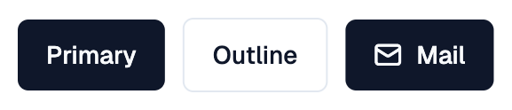
A Shadcn button.
Example:
shad.Button("Save", on_click=lambda e: print("saved"))
shad.Button("Delete", variant=shad.ButtonVariant.DESTRUCTIVE)
Inherits: LayoutControl
Properties
autofocus- Whether this button should be focused on initial display.bgcolor- The background color.color- The foreground (text and icon) color.content- The button's label.gap- The space betweenleading,contentandtrailing.hover_bgcolor- The background color while the pointer hovers over this button.hover_color- The foreground color while the pointer hovers over this button.leading- An icon or control shown beforecontent.size- The size of this button.trailing- An icon or control shown aftercontent.variant- The visual variant of this button.
Events
on_blur- Called when this button loses focus.on_click- Called when this button is clicked.on_focus- Called when this button receives focus.on_hover- Called when the pointer enters or exits this button.on_long_press- Called when this button is long-pressed.
Methods
focus- Requests focus for this button.
Example
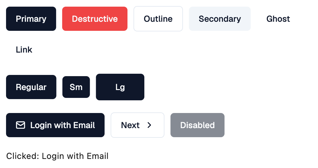
Shadcn Button
import flet_shadcn_ui as shad

import flet as ft


def main(page: ft.Page):
    page.title = "Shadcn Button"

    def handle_click(e: ft.Event[shad.Button]):
        message.value = f"Clicked: {e.control.content}"

    message = ft.Text("Click a button")

    page.add(
        ft.SafeArea(
            content=ft.Column(
                spacing=20,
                controls=[
                    ft.Row(
                        wrap=True,
                        controls=[
                            shad.Button(
                                v.name.title(), variant=v, on_click=handle_click
                            )
                            for v in shad.ButtonVariant
                        ],
                    ),
                    ft.Row(
                        wrap=True,
                        controls=[
                            shad.Button(s.name.title(), size=s, on_click=handle_click)
                            for s in shad.ButtonSize
                        ],
                    ),
                    ft.Row(
                        wrap=True,
                        controls=[
                            shad.Button(
                                "Login with Email",
                                leading=shad.LucideIcons.MAIL,
                                on_click=handle_click,
                            ),
                            shad.Button(
                                "Next",
                                trailing=shad.LucideIcons.CHEVRON_RIGHT,
                                variant=shad.ButtonVariant.OUTLINE,
                                on_click=handle_click,
                            ),
                            shad.Button("Disabled", disabled=True),
                        ],
                    ),
                    message,
                ],
            )
        )
    )


if __name__ == "__main__":
    ft.run(main)
Properties
autofocusclass-attributeinstance-attribute
autofocus: bool = FalseWhether this button should be focused on initial display.
bgcolorclass-attributeinstance-attribute
bgcolor: ColorValue | None = NoneThe background color.
If None, the color is taken from variant.
colorclass-attributeinstance-attribute
color: ColorValue | None = NoneThe foreground (text and icon) color.
If None, the color is taken from variant.
contentclass-attributeinstance-attribute
content: StrOrControl | None = NoneThe button's label.
If a string is provided, it is wrapped in a Text control.
gapclass-attributeinstance-attribute
gap: Number | None = NoneThe space between leading, content and trailing.
If None, defaults to 8.
hover_bgcolorclass-attributeinstance-attribute
hover_bgcolor: ColorValue | None = NoneThe background color while the pointer hovers over this button.
hover_colorclass-attributeinstance-attribute
hover_color: ColorValue | None = NoneThe foreground color while the pointer hovers over this button.
leadingclass-attributeinstance-attribute
leading: IconDataOrControl | None = NoneAn icon or control shown before content.
trailingclass-attributeinstance-attribute
trailing: IconDataOrControl | None = NoneAn icon or control shown after content.
variantclass-attributeinstance-attribute
variant: ButtonVariant = ButtonVariant.PRIMARYThe visual variant of this button.
Events
on_blurclass-attributeinstance-attribute
on_blur: ControlEventHandler[Button] | None = NoneCalled when this button loses focus.
on_clickclass-attributeinstance-attribute
on_click: ControlEventHandler[Button] | None = NoneCalled when this button is clicked.
on_focusclass-attributeinstance-attribute
on_focus: ControlEventHandler[Button] | None = NoneCalled when this button receives focus.
on_hoverclass-attributeinstance-attribute
on_hover: ControlEventHandler[Button] | None = NoneCalled when the pointer enters or exits this button.
The data property of the event handler argument is
True when the pointer entered, and False when it exited.
on_long_pressclass-attributeinstance-attribute
on_long_press: ControlEventHandler[Button] | None = NoneCalled when this button is long-pressed.