ExpansionTile
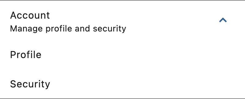
A single-line ListTile with an expansion arrow icon that expands or collapses the tile to reveal or hide its controls.
Example:
ft.ExpansionTile(
    width=400,
    title="Account",
    subtitle="Manage profile and security",
    expanded=True,
    controls=[
        ft.ListTile(title=ft.Text("Profile")),
        ft.ListTile(title=ft.Text("Security")),
    ],
)
Inherits: LayoutControl, AdaptiveControl
Properties
affinity- Typically used to force the expansion arrow icon to the tile'sleadingortrailingedge.animation_style- Defines the animation style (curve and duration) for this tile's expansion and collapse.bgcolor- The color to display behind the sublist whenexpanded.clip_behavior- Defines how the content of this tile is clipped.collapsed_bgcolor- Defines the background color of this tile when the sublist is collapsed (expandedis False).collapsed_icon_color- The icon color of this tile's expansion arrow icon when the sublist is collapsed (expandedis False).collapsed_shape- The tile's border shape when the sublist is collapsed.collapsed_text_color- The color of this tile's titles when the sublist is collapsed (expandedis False).controls- The controls to be displayed when this tileexpanded.controls_padding- Defines the padding around thecontrols.dense- Whether this list tile is part of a vertically dense list.enable_feedback- Whether detected gestures should provide acoustic and/or haptic feedback.expanded- The expansion state of this tile.expanded_alignment- Defines the alignment ofcontrols, which are arranged in a column when the tile is expanded.expanded_cross_axis_alignment- Defines the alignment of each child control withincontrolswhen the tile is expanded.icon_color- The icon color of this tile's expansion arrow icon when the sublist isexpanded.leading- A Control to display before thetitle.maintain_state- A boolean value which defines whether the state of thecontrolsis maintained when this tileexpandedand collapses.min_tile_height- The minimum height of this tile.shape- The border shape of this tile when the sublist isexpanded.show_trailing_icon- Whether this tile should build/show a default trailing icon, iftrailingisNone.subtitle- Additional content displayed below thetitle.text_color- The color of this tile's titles when the sublist isexpanded.tile_padding- Defines the tile's padding.title- A Control to display as primary content of this tile.trailing- A Control to display after thetitle.visual_density- Defines how compact this tile's layout will be.
Events
on_change- Called when a user clicks or taps the list tile.
Examples
ExpansionTile
import flet as ft


def main(page: ft.Page):
    page.theme_mode = ft.ThemeMode.LIGHT
    page.spacing = 0
    page.padding = 0

    def handle_tile_change(e: ft.Event[ft.ExpansionTile]):
        page.show_dialog(
            ft.SnackBar(
                duration=1000,
                content=ft.Text(
                    value=(
                        f"ExpansionTile was "
                        f"{'expanded' if e.data == 'true' else 'collapsed'}"
                    )
                ),
            )
        )
        if e.control.trailing:
            e.control.trailing.icon = (
                ft.Icons.ARROW_DROP_DOWN
                if e.control.trailing.icon == ft.Icons.ARROW_DROP_DOWN_CIRCLE
                else ft.Icons.ARROW_DROP_DOWN_CIRCLE
            )
            e.control.trailing.update()

    page.add(
        ft.SafeArea(
            content=ft.Column(
                spacing=0,
                controls=[
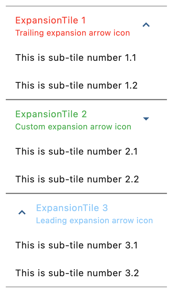
                    ft.ExpansionTile(
                        expanded=True,
                        title=ft.Text("ExpansionTile 1"),
                        subtitle=ft.Text("Trailing expansion arrow icon"),
                        affinity=ft.TileAffinity.PLATFORM,
                        maintain_state=True,
                        collapsed_text_color=ft.Colors.RED,
                        text_color=ft.Colors.RED,
                        controls=[
                            ft.ListTile(title=ft.Text("This is sub-tile number 1.1")),
                            ft.ListTile(title=ft.Text("This is sub-tile number 1.2")),
                        ],
                    ),
                    ft.ExpansionTile(
                        expanded=True,
                        title=ft.Text("ExpansionTile 2"),
                        subtitle=ft.Text("Custom expansion arrow icon"),
                        trailing=ft.Icon(ft.Icons.ARROW_DROP_DOWN),
                        collapsed_text_color=ft.Colors.GREEN,
                        text_color=ft.Colors.GREEN,
                        on_change=handle_tile_change,
                        controls=[
                            ft.ListTile(title=ft.Text("This is sub-tile number 2.1")),
                            ft.ListTile(title=ft.Text("This is sub-tile number 2.2")),
                        ],
                    ),
                    ft.ExpansionTile(
                        expanded=True,
                        title=ft.Text("ExpansionTile 3"),
                        subtitle=ft.Text("Leading expansion arrow icon"),
                        affinity=ft.TileAffinity.LEADING,
                        collapsed_text_color=ft.Colors.BLUE_800,
                        text_color=ft.Colors.BLUE_200,
                        controls=[
                            ft.ListTile(title=ft.Text("This is sub-tile number 3.1")),
                            ft.ListTile(title=ft.Text("This is sub-tile number 3.2")),
                        ],
                    ),
                ],
            ),
        ),
    )


if __name__ == "__main__":
    ft.run(main)
Programmatic expansion
import flet as ft


def main(page: ft.Page):
    page.spacing = 20

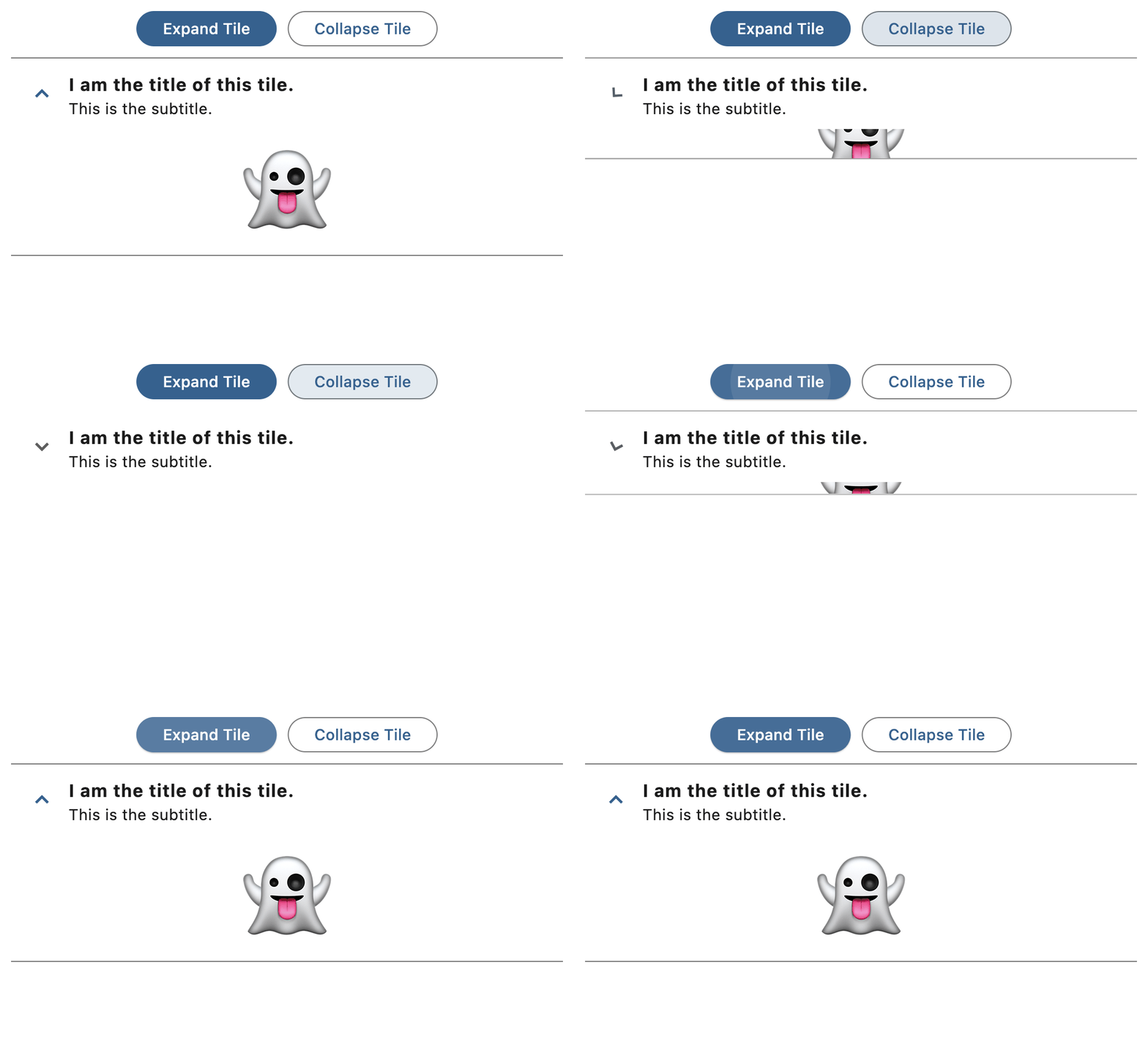
    tile = ft.ExpansionTile(
        title=ft.Text("I am the title of this tile.", weight=ft.FontWeight.BOLD),
        subtitle=ft.Text("This is the subtitle."),
        affinity=ft.TileAffinity.LEADING,
        controls=[ft.Text("👻", size=80)],
        expanded=True,
        on_change=lambda e: print(f"Tile was {'expanded' if e.data else 'collapsed'}"),
    )

    def expand_tile(_: ft.Event[ft.FilledButton]):
        tile.expanded = True
        tile.update()

    def collapse_tile(_: ft.Event[ft.OutlinedButton]):
        tile.expanded = False
        tile.update()

    page.add(
        ft.SafeArea(
            content=ft.Column(
                controls=[
                    ft.Row(
                        alignment=ft.MainAxisAlignment.CENTER,
                        controls=[
                            ft.FilledButton("Expand Tile", on_click=expand_tile),
                            ft.OutlinedButton("Collapse Tile", on_click=collapse_tile),
                        ],
                    ),
                    tile,
                ],
            ),
        )
    )


if __name__ == "__main__":
    ft.run(main)
Custom animations
import flet as ft


def main(page: ft.Page):
    page.horizontal_alignment = ft.CrossAxisAlignment.CENTER
    page.spacing = 20

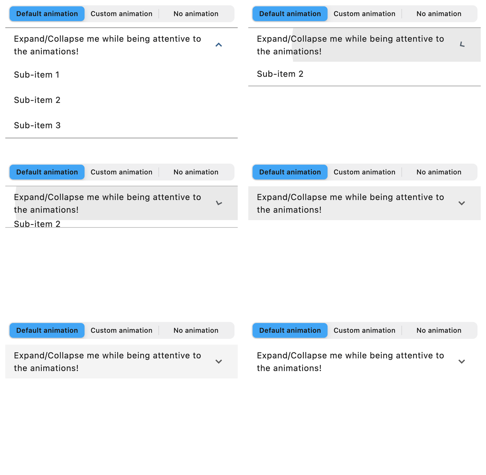
    tile = ft.ExpansionTile(
        expanded=True,
        title=ft.Text("Expand/Collapse me while being attentive to the animations!"),
        controls=[
            ft.ListTile(title=ft.Text("Sub-item 1")),
            ft.ListTile(title=ft.Text("Sub-item 2")),
            ft.ListTile(title=ft.Text("Sub-item 3")),
        ],
    )

    def switch_animation(e: ft.Event[ft.CupertinoSlidingSegmentedButton]):
        if e.control.selected_index == 0:
            tile.animation_style = None
        elif e.control.selected_index == 1:
            tile.animation_style = ft.AnimationStyle(
                curve=ft.AnimationCurve.BOUNCE_OUT,
                duration=ft.Duration(seconds=5),
            )
        else:
            tile.animation_style = ft.AnimationStyle.no_animation()
        tile.update()

    page.add(
        ft.SafeArea(
            content=ft.Column(
                horizontal_alignment=ft.CrossAxisAlignment.CENTER,
                controls=[
                    ft.CupertinoSlidingSegmentedButton(
                        selected_index=0,
                        thumb_color=ft.Colors.BLUE_400,
                        on_change=switch_animation,
                        controls=[
                            ft.Text("Default animation"),
                            ft.Text("Custom animation"),
                            ft.Text("No animation"),
                        ],
                    ),
                    tile,
                ],
            ),
        )
    )


if __name__ == "__main__":
    ft.run(main)
Theme mode toggle
import flet as ft


def main(page: ft.Page):
    page.spacing = 0
    page.padding = 0
    page.theme_mode = ft.ThemeMode.LIGHT

    def handle_switch_change(e: ft.Event[ft.Switch]):
        page.theme_mode = ft.ThemeMode.DARK if e.control.value else ft.ThemeMode.LIGHT
        e.control.thumb_icon = (
            ft.Icons.DARK_MODE
            if page.theme_mode == ft.ThemeMode.DARK
            else ft.Icons.LIGHT_MODE
        )
        page.update()

    def handle_expansion_tile_change(e: ft.Event[ft.ExpansionTile]):
        page.show_dialog(
            ft.SnackBar(
                duration=1000,
                content=ft.Text(
                    value=(
                        f"ExpansionTile was "
                        f"{'expanded' if e.data == 'true' else 'collapsed'}"
                    )
                ),
            )
        )
        if e.control.trailing:
            e.control.trailing.icon = (
                ft.Icons.ARROW_DROP_DOWN
                if e.control.trailing.icon == ft.Icons.ARROW_DROP_DOWN_CIRCLE
                else ft.Icons.ARROW_DROP_DOWN_CIRCLE
            )
            e.control.trailing.update()

    switch = ft.Switch(
        thumb_icon=ft.Icons.DARK_MODE,
        on_change=handle_switch_change,
    )

    page.add(
        ft.SafeArea(
            content=ft.Column(
                spacing=0,
                controls=[
                    ft.ExpansionTile(
                        key="theme_mode_toggle_top_panel",
                        title=ft.Text("ExpansionTile 1"),
                        subtitle=ft.Text("Trailing expansion arrow icon"),
                        bgcolor=ft.Colors.BLUE_GREY_200,
                        collapsed_bgcolor=ft.Colors.BLUE_GREY_200,
                        affinity=ft.TileAffinity.PLATFORM,
                        maintain_state=True,
                        collapsed_text_color=ft.Colors.RED,
                        text_color=ft.Colors.RED,
                        controls=[
                            ft.ListTile(
                                title=ft.Text("This is sub-tile number 1"),
                                bgcolor=ft.Colors.BLUE_GREY_200,
                            )
                        ],
                    ),
                    ft.ExpansionTile(
                        title=ft.Text("ExpansionTile 2"),
                        subtitle=ft.Text("Custom expansion arrow icon"),
                        trailing=ft.Icon(ft.Icons.ARROW_DROP_DOWN),
                        collapsed_text_color=ft.Colors.GREEN,
                        text_color=ft.Colors.GREEN,
                        on_change=handle_expansion_tile_change,
                        controls=[
                            ft.ListTile(title=ft.Text("This is sub-tile number 2"))
                        ],
                    ),
                    ft.ExpansionTile(
                        title=ft.Text("ExpansionTile 3"),
                        subtitle=ft.Text("Leading expansion arrow icon"),
                        affinity=ft.TileAffinity.LEADING,
                        expanded=True,
                        collapsed_text_color=ft.Colors.BLUE_800,
                        text_color=ft.Colors.BLUE_200,
                        controls=[
                            ft.ListTile(title=ft.Text("This is sub-tile number 3")),
                            ft.ListTile(title=ft.Text("This is sub-tile number 4")),
                            ft.ListTile(title=ft.Text("This is sub-tile number 5")),
                        ],
                    ),
                    ft.Row(
                        expand=True,
                        alignment=ft.MainAxisAlignment.END,
                        controls=[
                            ft.Container(
                                padding=ft.Padding.only(bottom=50),
                                alignment=ft.Alignment.BOTTOM_RIGHT,
                                expand=True,
                                content=switch,
                            ),
                        ],
                    ),
                ],
            ),
        )
    )


if __name__ == "__main__":
    ft.run(main)
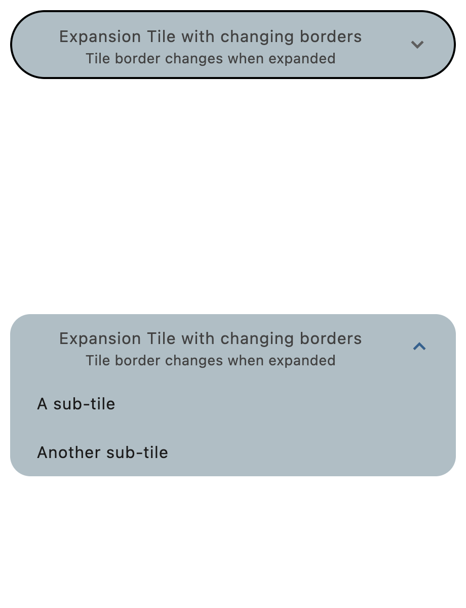
Borders
import flet as ft


def main(page: ft.Page):
    page.theme_mode = ft.ThemeMode.LIGHT

    page.add(
        ft.SafeArea(
            content=ft.ExpansionTile(
                title=ft.Text(
                    value="Expansion Tile with changing borders",
                    text_align=ft.TextAlign.CENTER,
                ),
                subtitle=ft.Text(
                    value="Tile border changes when expanded",
                    text_align=ft.TextAlign.CENTER,
                ),
                bgcolor=ft.Colors.BLUE_GREY_200,
                controls_padding=ft.Padding.symmetric(horizontal=10),
                collapsed_bgcolor=ft.Colors.BLUE_GREY_200,
                affinity=ft.TileAffinity.PLATFORM,
                maintain_state=True,
                shape=ft.RoundedRectangleBorder(radius=20),
                collapsed_shape=ft.StadiumBorder(side=ft.BorderSide(width=2)),
                collapsed_text_color=ft.Colors.GREY_800,
                text_color=ft.Colors.GREY_800,
                controls=[
                    ft.ListTile(
                        title=ft.Text("A sub-tile"),
                        bgcolor=ft.Colors.BLUE_GREY_200,
                        shape=ft.RoundedRectangleBorder(radius=20),
                    ),
                    ft.ListTile(
                        title=ft.Text("Another sub-tile"),
                        bgcolor=ft.Colors.BLUE_GREY_200,
                        shape=ft.RoundedRectangleBorder(radius=20),
                    ),
                ],
            ),
        )
    )


if __name__ == "__main__":
    ft.run(main)
Properties
affinityclass-attributeinstance-attribute
affinity: TileAffinity | None = NoneTypically used to force the expansion arrow icon to the tile's leading or trailing edge.
If None, ListTileTheme.affinity is used;
if that is also None, then defaults to TileAffinity.TRAILING
(the expansion arrow icon appears on the tile's trailing edge).
animation_styleclass-attributeinstance-attribute
animation_style: AnimationStyle | None = NoneDefines the animation style (curve and duration) for this tile's expansion and collapse.
If AnimationStyle.duration is provided, it will be used to override
the expansion animation duration. If it is None, then
AnimationStyle.duration from the
ExpansionTileTheme.animation_style will be used. If that is also
None, Duration(milliseconds=200) will be used as default.
If AnimationStyle.curve is provided, it will be used to override
the expansion animation curve. If it is None, then
AnimationStyle.curve from the
ExpansionTileTheme.animation_style will be used. If that is also
None, AnimationCurve.EASE_IN will be used as default.
If AnimationStyle.reverse_curve is provided, it will be used to override
the collapse animation curve. If it is None, then
AnimationStyle.reverse_curve from the
ExpansionTileTheme.animation_style will be used. If that is also
None, the expansion curve will be used as default.
To disable the animations, use
AnimationStyle.no_animation.
bgcolorclass-attributeinstance-attribute
bgcolor: ColorValue | None = NoneThe color to display behind the sublist when expanded.
If None, ExpansionTileTheme.bgcolor is used;
if that is also None, then defaults to Colors.TRANSPARENT.
clip_behaviorclass-attributeinstance-attribute
clip_behavior: ClipBehavior | None = NoneDefines how the content of this tile is clipped.
If set and a custom collapsed or expanded shape is provided, this value determines how this tile is clipped.
If None, ExpansionTileTheme.clip_behavior is used;
if that is also None, then defaults to ClipBehavior.ANTI_ALIAS.
collapsed_bgcolorclass-attributeinstance-attribute
collapsed_bgcolor: ColorValue | None = NoneDefines the background color of this tile when the sublist is collapsed (expanded is False).
If None, ExpansionTileTheme.collapsed_bgcolor is used;
if that is also None, then defaults to Colors.TRANSPARENT.
collapsed_icon_colorclass-attributeinstance-attribute
collapsed_icon_color: ColorValue | None = NoneThe icon color of this tile's expansion arrow icon when the sublist is collapsed (expanded is False).
If None, ExpansionTileTheme.collapsed_icon_color is used;
if that is also None, then defaults to ColorScheme.on_surface
of the Page.theme.
collapsed_shapeclass-attributeinstance-attribute
collapsed_shape: OutlinedBorder | None = NoneThe tile's border shape when the sublist is collapsed.
If None, ExpansionTileTheme.shape is used;
if that is also None, then defaults to a Border with vertical sides
of color Colors.TRANSPARENT.
collapsed_text_colorclass-attributeinstance-attribute
collapsed_text_color: ColorValue | None = NoneThe color of this tile's titles when the sublist is collapsed (expanded is False).
If None, ExpansionTileTheme.collapsed_text_color is used;
if that is also None, then defaults to TextTheme.body_large
of the Theme.text_theme.
controlsclass-attributeinstance-attribute
controls: list[Control] | None = NoneThe controls to be displayed when this tile expanded.
Typically a list of ListTile controls.
controls_paddingclass-attributeinstance-attribute
controls_padding: PaddingValue | None = NoneDefines the padding around the controls.
If None, ExpansionTileTheme.controls_padding is used;
if that is also None, then defaults to Padding.all(0).
denseclass-attributeinstance-attribute
dense: bool | None = NoneWhether this list tile is part of a vertically dense list.
Dense tiles default to having a smaller height.
It is not recommended to set this property to True when in Material3.
If None, then its value is based on ListTileTheme.dense.
enable_feedbackclass-attributeinstance-attribute
enable_feedback: bool = TrueWhether detected gestures should provide acoustic and/or haptic feedback. For example, on Android a tap will produce a clicking sound and a long-press will produce a short vibration, when feedback is enabled.
expandedclass-attributeinstance-attribute
expanded: bool = FalseThe expansion state of this tile.
True - expanded, False - collapsed.
expanded_alignmentclass-attributeinstance-attribute
expanded_alignment: Alignment | None = NoneDefines the alignment of controls, which are arranged in a column when the tile is expanded.
If None, ExpansionTileTheme.expanded_alignment is used;
if that is also None, then defaults to Alignment.CENTER.
expanded_cross_axis_alignmentclass-attributeinstance-attribute
expanded_cross_axis_alignment: CrossAxisAlignment = (
    CrossAxisAlignment.CENTER
)
Defines the alignment of each child control within controls when the tile is expanded.
Raises:
- ValueError - If set to
CrossAxisAlignment.BASELINE.
icon_colorclass-attributeinstance-attribute
icon_color: ColorValue | None = NoneThe icon color of this tile's expansion arrow icon when the sublist is expanded.
If None, ExpansionTileTheme.icon_color is used;
if that is also None, then defaults to ColorScheme.primary
of the Page.theme.
leadingclass-attributeinstance-attribute
leading: IconDataOrControl | None = NoneA Control to display before the title.
Typically a CircleAvatar control.
Depending on the value of affinity, this control
may replace the rotating expansion arrow icon.
maintain_stateclass-attributeinstance-attribute
maintain_state: bool = FalseA boolean value which defines whether the state of the controls is maintained when this tile expanded and collapses.
When True, the children are kept in the tree while the tile is collapsed.
When False (default), the controls are removed from the tree when
the tile is collapsed and recreated upon expansion.
min_tile_heightclass-attributeinstance-attribute
min_tile_height: Number | None = NoneThe minimum height of this tile.
If None, the default tile heights are 56.0, 72.0, and 88.0 for one, two,
and three lines of text respectively. If dense is True, these defaults
are changed to 48.0, 64.0, and 76.0. A visual density value or a large title
will also adjust the default tile heights.
shapeclass-attributeinstance-attribute
shape: OutlinedBorder | None = NoneThe border shape of this tile when the sublist is expanded.
If None, ExpansionTileTheme.shape is used;
if that is also None, then defaults to a Border with vertical sides
of color Theme.divider_color.
show_trailing_iconclass-attributeinstance-attribute
show_trailing_icon: bool = TrueWhether this tile should build/show a default trailing icon, if trailing is None.
subtitleclass-attributeinstance-attribute
subtitle: StrOrControl | None = NoneAdditional content displayed below the title.
Typically a Text control.
text_colorclass-attributeinstance-attribute
text_color: ColorValue | None = NoneThe color of this tile's titles when the sublist is expanded.
If None, ExpansionTileTheme.text_color is used;
if that is also None, then defaults to TextTheme.body_large
of the Theme.text_theme.
tile_paddingclass-attributeinstance-attribute
tile_padding: PaddingValue | None = NoneDefines the tile's padding.
Analogous to ListTile.content_padding, this property defines the
insets for the leading, title, subtitle and
trailing controls. It does not inset the expanded
controls widgets.
If None, ExpansionTileTheme.tile_padding is used;
if that is also None, then defaults to Padding.symmetric(horizontal=16.0).
titleinstance-attribute
title: StrOrControlA Control to display as primary content of this tile.
Typically a Text control.
Raises:
- ValueError - If it is neither a string nor a visible
Control.
trailingclass-attributeinstance-attribute
trailing: IconDataOrControl | None = NoneA Control to display after the title.
Typically an Icon control.
Depending on the value of affinity, this control
may replace the rotating expansion arrow icon.
visual_densityclass-attributeinstance-attribute
visual_density: VisualDensity | None = NoneDefines how compact this tile's layout will be.
Events
on_changeclass-attributeinstance-attribute
on_change: ControlEventHandler[ExpansionTile] | None = NoneCalled when a user clicks or taps the list tile.
The Event.data property of the event handler argument is a boolean
representing the expanded state of the tile after the change.